Our research uncovered four signals that score reasonably well on both metrics when they are more than one standard deviation below their means. They’re the key component of our risk dashboard:
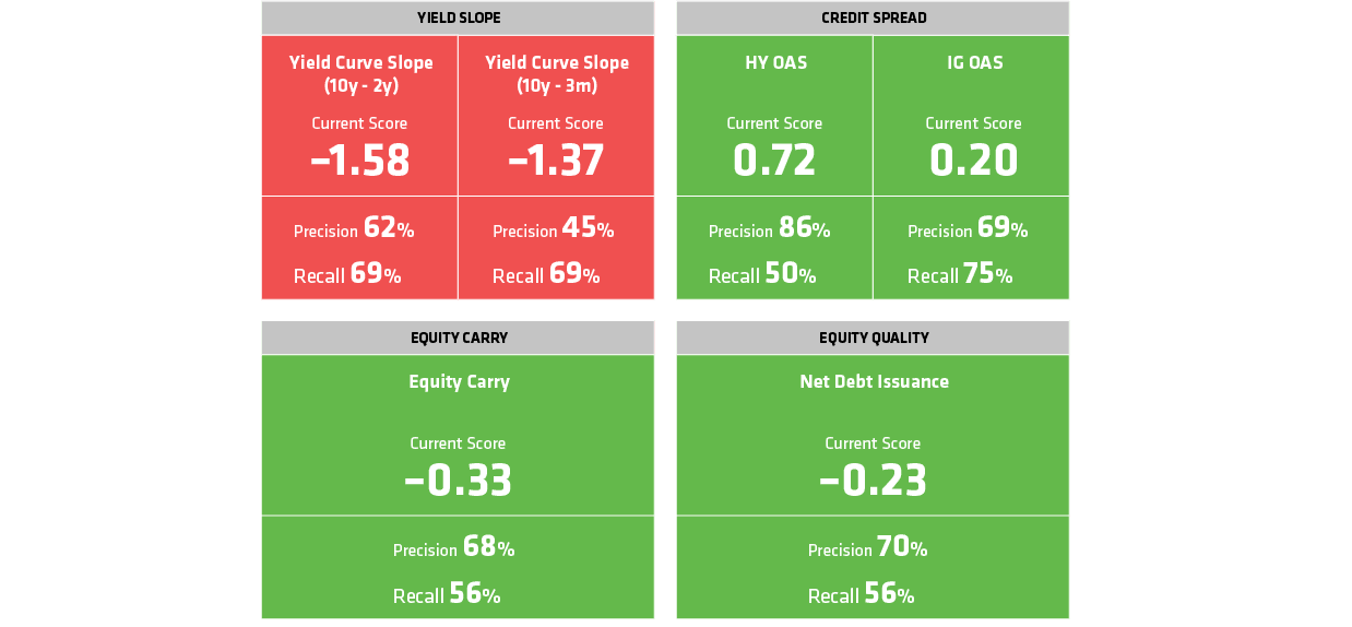
1. The yield curve. Specifically, we look at two measures—the difference between 10-year and two-year Treasury yields, and the difference between 10-year and three-month yields (the part of the curve that inverted in March). The slope tells us a lot about bank profitability. Banks borrow at short-term yields and lend at long-term yields, so when short-term rates rise above long-term rates, profits decline. An inverted curve also signals slower economic growth and low inflation expectations, which has broader implications for corporate profits.
2. Credit spreads. This is the extra yield that investment-grade and high-yield corporate bonds provide investors over comparable Treasury bond yields. Credit spreads are a reliable measure of overall corporate health and creditworthiness; the higher the yield spread, the higher the borrowing cost for companies—and the potential risk for investors.
3. Equity carry. This measures the equity market’s near-term valuation. Specifically, we evaluate a host of trailing and forward measures of earnings, dividends and cash-flow yields relative to short rates. When equities are yielding low on these measures, it suggests that the market is expensive and that the probability of a sell-off is high.
4. Equity quality. Quality is an indicator we use to assess whether corporate balance sheets are generally overextended. Overextension is common late in the cycle because companies tend to overestimate future demand and build extra capacity to meet it. But when demand doesn’t materialize, equities often sell off. To gauge quality, we analyze metrics such as net equity issuance versus share buybacks, net debt relative to net cash, and capital expenditures relative to depreciation.
The Risk of False Alarms
Here’s the interesting thing: the yield curve was the only one of the four signals flashing a warning when it inverted on March 22. As we’ve seen, no signal is infallible—not even the big four.
According to our models, inversions with the three-month Treasury yield above the 10-year yield—the scenario last month—have had a historical precision of 45%. That’s pretty good compared to signals that didn’t earn a spot on our dashboard. But an inverted curve still turned out to be a false alarm more than half the time over the past seven decades.
So, what does this all mean? For now, not too much. At the moment, credit spreads, equity carry and equity quality signals are either neutral or slightly bullish when it comes to taking equity risk. That wasn’t the case when the curve inverted briefly in December. At that time, two other signals—credit spreads and equity carry—were also flashing red.
That was the time to rein in risk exposure—in part because equities tend to sell off as the curve flattens, and the market starts to price in slower growth and a possible recession. After the curve actually inverts, stocks tend to rebound, often because the Federal Reserve either begins to cut interest rates or, as it did at the start of 2019, stops raising them.
The way we see it, yield-curve inversion on its own is something to monitor, not a sign that it’s time to change your asset allocation. And it’s only one of the four signals that we think provide a better reading on equity risk. Without confirmation from at least one of the other three, there’s a fair chance that the yield curve is sending a false alarm.